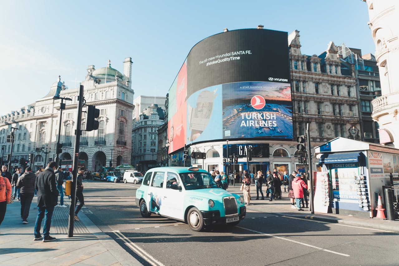
Billboard advertising is a powerful tool. When done right, it can make people laugh at a red light, turn heads on a highway, or spark conversations on social media. But when it’s done wrong, it can be a costly—and very public—lesson in what not to do.
With only a few seconds to make an impression, a billboard has to be bold, clear, and impactful. That’s a tall order in a world where attention spans are short and distractions are everywhere. Unfortunately, some campaigns miss the mark entirely—either by being too confusing, poorly placed, or just plain tone-deaf.
Here’s a look at some of the most common billboard advertising mistakes, illustrated with real-world examples, and how you can avoid them in your own campaigns.
1. Too Much Text, Too Little Time
The Mistake: Trying to cram an entire paragraph into a space drivers glance at for maybe three seconds.
One of the most common blunders in billboard advertising is treating the space like a magazine ad or webpage. Long sentences, multiple calls-to-action, and small fonts are a recipe for confusion—not conversion.
Real Example: A local law firm once ran a billboard with a full list of services, a web address, and a phone number. The problem? You’d need to pull over on the side of the highway to read it. Nobody did.
Lesson: Stick to a clear, simple message. Aim for seven words or fewer. Your billboard should communicate one idea, not five.
2. Poor Design Choices
The Mistake: Using low-contrast colors, unreadable fonts, or cluttered layouts.
A billboard isn’t just about the message—it’s about how it’s presented. If the text blends into the background or the imagery is chaotic, your audience won’t know where to look (or why they should care).
Real Example: A regional clothing brand launched a billboard with white text over a pale gray background. From a distance, it looked completely blank. The campaign ran for a full month before anyone realized it wasn’t working.
Lesson: Use high contrast, large fonts, and clean design. If it’s not legible from 300 feet away, it doesn’t belong on a billboard.
3. Wrong Location for the Message
The Mistake: Placing your billboard in a spot where your target audience won’t see it—or worse, where the message becomes ironic or inappropriate.
Location is everything in out-of-home advertising. A clever ad can fall flat if it’s in the wrong context. Worse, it might come off as tone-deaf or offensive.
Real Example: A fast-food ad boasting “Only 2 Minutes Away!” was placed along a remote rural highway—where the nearest location was actually 25 minutes in the opposite direction. The backlash online was swift.
Lesson: Make sure your message matches the context. Choose placements based on traffic patterns, local demographics, and the relevance of your message to the area.
4. Failing to Adapt to Digital
The Mistake: Treating a digital billboard the same as a static one, without taking advantage of its unique strengths.
Digital billboards can rotate ads, respond to real-time events, or change based on time of day. Yet many brands simply upload a still image and leave it up for weeks.
Real Example: A national electronics brand used a digital board to promote a Black Friday deal—then forgot to update it. By mid-December, it was still advertising “One Day Only” prices that had long since expired.
Lesson: If you’re using digital, think dynamically. Update your content regularly and consider using time-sensitive or interactive messaging.
5. Trying Too Hard to Be Funny (and Failing)
The Mistake: Humor can be great—but if it misses the mark, it can confuse or alienate your audience.
Not every joke translates well at 60 miles per hour. Some puns fall flat, and edgy humor can easily cross the line into offense, especially when there’s no room for nuance.
Real Example: A gym once ran a billboard that said, “You’re not ugly, you’re just fat.” It was meant to be cheeky and motivational—but it was immediately called out for body shaming and removed after public backlash.
Lesson: Humor needs to be tested and context-aware. Ask yourself: Is it inclusive? Will it make sense out of context? Does it align with your brand voice?
6. Ignoring the Call to Action
The Mistake: Creating a visually impressive ad with no next step for the audience to take.
You’ve caught their eye—now what? A billboard that doesn’t provide a clear direction can leave viewers impressed, but unmoved.
Real Example: A travel company ran a stunning billboard with a beach scene and the phrase, “Find Your Escape.” That was it. No website, no brand name, no QR code. No one knew who the ad was for.
Lesson: Always include a clear and memorable call to action—even if it’s just a logo, short URL, or hashtag. Your viewer should know what to do next.
7. Tone-Deaf Messaging
The Mistake: Launching a billboard campaign without considering current events, cultural sensitivities, or the social mood.
A message that seemed harmless in the brainstorming session can look completely out of touch once it’s live in the real world.
Real Example: At the height of the COVID-19 pandemic, a rideshare company launched a billboard encouraging people to “Get out and explore.” It came across as reckless and irresponsible, especially in areas under lockdown.
Lesson: Always gut-check your message against current events. Timing and tone are just as important as creativity.
Final Thoughts: Be Bold, But Be Smart
Billboard advertising has the power to captivate, entertain, and drive real results—but only if it’s executed with care. The most successful campaigns are those that understand the medium’s limitations, harness its strengths, and avoid the pitfalls that have tripped up others.
So before you put your message up in lights, ask yourself:
- Is it clear and easy to read?
- Does it stand out visually?
- Will the right people see it in the right place?
- Is the tone appropriate and on-brand?
- Is there a clear takeaway or next step?
With a thoughtful strategy and a healthy dose of common sense, your billboard can make a lasting impression—for all the right reasons.


